Showing posts with label yearbook. Show all posts

Wednesday, 21 May 2014

EVALUATION - Yearbook

I was extremely happy with how effectively we all worked together during this brief. I feel that we were very organised and efficient, making sure to relay all information to each other and to the tutors. We were always aware of deadlines, and when things needed to be completed by - such as getting all of the content, taking photographs of work and organising the students. In addition to this, when one of us was unable to attend a meeting or a session, this wasn't a problem as any issues raised would be discussed later on and everyone would be brought back into the loop - there was always someone there when needed.

There was a lot of content and information we needed to gather from the textiles students. With the help of Duncan, we were able to post any necessary information on their main forum, setting up a dropbox where files could be sent for us to use. We created a strong relationship with the Textiles team, making sure to always be professional and organised.

As there was three of us, we had a range of skill sets, allowing us to present and design effectively, whilst having equal amounts of work to complete. Compromise was a main factor within this, allowing everyone to have their own input and knowing when to back down. I didn’t particularly think that I would enjoy working with type, grid and layout, however I have become much more confident within this area of design, broadening my practice and allowing me to strengthen my skills, which can then be applied to my design context publication. The brief has been extremely technical, which required more care and consideration than other briefs.


I am extremely pleased with how this project has turned out, and we are all glad that we decided to take it on. The content, layout and visuals all really compliment us as individuals, as well as a working group, and this is something that we will definitely be putting in our portfolios. Each step was managed well in order to produce an outcome that we are proud of.

Saturday, 17 May 2014

YEARBOOK - collab evaluation

Evaluation:

I was extremely happy with how effectively we all worked together during this brief. I feel that we were very organised and efficient, making sure to relay all information to each other and to the tutors. We were always aware of deadlines, and when things needed to be completed by - such as getting all of the content, taking photographs of work and organising the students. In addition to this, when one of us was unable to attend a meeting or a session, this wasn't a problem as any issues raised would be discussed later on and everyone would be brought back into the loop - there was always someone there when needed.

There was a lot of content and information we needed to gather from the textiles students. With the help of Duncan, we were able to post any necessary information on their main forum, setting up a dropbox where files could be sent for us to use. We created a strong relationship with the Textiles team, making sure to always be professional and organised.

As there was three of us, we had a range of skill sets, allowing us to present and design effectively, whilst having equal amounts of work to complete. Compromise was a main factor within this, allowing everyone to have their own input and knowing when to back down.

I am extremely pleased with how this project has turned out, and we are all glad that we decided to take it on. The content, layout and visuals all really compliment us as individuals, as well as a working group, and this is something that we will definitely be putting in our portfolios. Each step was managed well in order to produce an outcome that we are proud of.

Friday, 16 May 2014

YEARBOOK - poster design

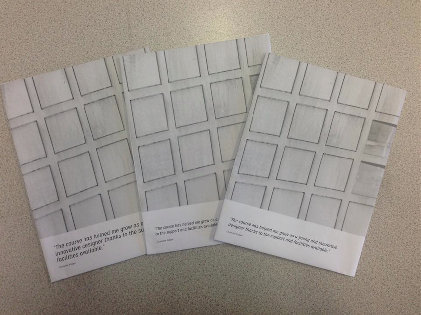
Now that the yearbook itself was complete, myself and Jenna set out to design the wrap around poster that would be featured on the front cover. A few days previous, we saw Textiles student Phoebe Baskett down in digital print, printing off some of her final designs. We both noticed one print in particular that we felt would be perfect for the yearbook in terms of its colour and overall aesthetics. We therefore got in touch with Phoebe to ask whether or not it was ok to feature her design on the cover, and to see if it would be possible for her to send us a high res version of the print.

Myself and Jenna then started to develop some possible layout designs for the posters. The front would evidently feature the print, and we wanted the reverse to list the names of all the students on the course so that it could be kept as a keepsake and a reminder.

We started off by simply listening the names on a document the correct size for the wrap around cover. We then split these into thirds and experimented with possible layouts, trying to make effective use of white space. The design was evidently too sparse, so we change the weight and pt size of the type to see whether or not this would improve it.


It was initially a struggle to find a composition that suited a long list of names, as it was quite hard to fill up the space with text that was necessary. In order to try and break up the design, we explored the inclusion of linear spacing, as well as placing in the title of the course, which was a vital piece of content. 


As these designs weren't working visually, I suggested that we see what it would look like if the date was large scale and placed behind the names, placing focus on the year as a cohort.

We picked out colours that were featured in Phoebe's design, and experimented with opacities so that the names were still readable, as well as looking at using different weights and compositions. 


As the design was quite hard to visualise on screen, we decided that the best idea would be for us to print out some mock ups. We could then place it on the wall so that we could consider scale and legibility. 


Changes to be made:

1. Large scale date needs to shrink to be more centralised
2. Space between course title and names needs to be decreased
3. Title needs amending


After these changes were made, we felt that the design was much more focused and centralised. I then suggested the possibility of defining Phoebe's print as a pattern, and using it to fill the numbers. Jenna thought that this was a great idea, and it would add more context and relevance to the poster.


After utilising the pattern, we printed off some more mock ups, experimenting with different weights in order to increase readability of the poster. We felt that this design was extremely successful and reflective of the vision that we initially had. We will show the design to Emily tomorrow in order to gain her feedback.

YEARBOOK - ammendments

During a meeting with Phil, it was suggested that we change all of the headings that were in a serif typeface, from uppercase to lowercase. This was because it almost seemed like we were shouting and being quite abrupt and unnecessary. After amending the type to all be lowercase, myself and Jenna decided that it wasn't what we were looking for visually, whereas Emily felt that it could possibly work.

As we weren't happy, I suggested that perhaps we looked at changing the typeface completely. After just completing my Design Context publication, I had been working with a sans serif type called Mission Gothic, which was almost decorative when the kerning was adjusted. It also worked extremely well in lowercase, and Jenna agreed with me that it looked a lot more contemporary and reflected the nature of the course better than the previous typeface.

Original tyepface:


Original typeface lowercase:


Amended typeface:


We then showed Emily to see whether or not she agreed with our thoughts. She was excited about the new typeface, and felt that it was much more relevant. Myself and Jenna then organised to see Phil again to discuss whether or not it would be appropriate for us to make such a big change at this stage. He said that as long as we were able to evaluate our reasonings for choosing the typeface then that was fine. However, he mentioned that the pt size may need to be altered.


We printed out three different versions in order to see how the pt sized worked against the composition of the image and alongside the white space on the page. 

Friday, 9 May 2014

YEARBOOK - amendments

Amendments - images courtesy of Jenna Morse

After sending the yearbook off to Phil and Duncan in it's current state, we were given a rough printed version with a few minor amendments on, such as typos. Myself and Jenna went through the document and corrected everything that had been highlighted on the layouts. This was good practice as we didn't want our final document to have any mistakes in as we wanted a professional finish to a high standard.


Monday, 21 April 2014

YEARBOOK - cover development

Collectively as a Textiles Team, we made the decision to scrap the brief that we had initially compiled for the student's to complete. It was agreed that it was unlikely that any of the students would actually have any time to complete the brief, and that we probably wouldn't receive any responses. Despite this, we still decided to go ahead with the wrap around concept, using an existing print to create a focal point for the publication, representing the course as a whole. We therefore made the decision to pick the print ourselves based on personal preference, and what we felt would be the most eye catching, creating interaction with the product.

Below we have started to experiment with some possible layouts, using the 11/14 mentioned in our initial pitch to represent the students time on the course. We picked some patterns that stood out to us from the ones that were sent in, to see what kind of impact they would make. 


One of the designs sent in to us by Phoebe Baskett really stood out to us as an inspiring and contemporary print that reflected the course in terms of their skill, ability and knowledge of processes. We therefore decided to contact Phoebe to see whether or not she could send us in any more designs, so that we could see some variation. 

Thursday, 10 April 2014

YEARBOOK - pairing

Now that we had all of the content we needed for the book in terms of the student's work, myself and Jenna began to pair the images together. We wanted the publication to look consistent and complimentary, without creating a colour coding system.

We found this process quite challenging, as all of the work is extremely individual and visually different. We therefore paired the images together as best we could looking at factors such as shape, colour, theme, format and scale. Some images we couldn't pair straight away, however we felt that as the layout developed, we would be able to fix this.

Below are some examples of the exploration of layouts and how they developed and changed over time, depending on composition, scale and page assignment.