As we were required to demonstrate appropriate preparation for our stated progression ambitions, it was necessary to have both print and web based outcomes in the form of personal branding in order to create a successful design presence. The basis of my identity was formed from four specific colours that I had come across during research into one of my briefs, that had caught my eye in terms of reflecting my own practice. I feel that I have developed a personal and unique focal visual of my name, taking on a playful and reflective aesthetic, that would work alongside examples of my prints, patterns and illustrations as a direct representation of both my design and my ambitions.
When it came to researching for my personal branding, I found that a lot of the content within my Design Context publication really helped to inform my design decisions. I had already gathered a lot of imagery that focused on range, process, colour and stationery, which was the perfect starting point for determining what exactly my branding should look like. Because of this informed research I was able to be efficient and organised with my design development.
I feel that I have successfully presented myself in a way that not only represents my practice, but also the type of design that interests me. This meant that through the exploration of primary and secondary sources, including business cards, I could see how similar designers had approached their own identity and how they had applied this to a range of appropriate products.
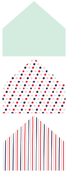
A range of colours were used throughout that automatically connect to the type of design I am attracted to, focusing on pastel shades alongside contrasting elements. Print and pattern has been incorporated throughout as I feel that this is where my practice currently lies. In terms of contacting studios, a small pack would be sent off that would include a cover letter, my CV, a range of postcards and also business cards which have been triplex printed. These would all be tied together with string and sent off in an envelope with a DIY printed liner. I hope that this shows attention to detail, unifying my overall branding.
In terms of weaknesses, I feel that the crafting of my products is not up to the standard that I would have liked. In due course, I will get them printed professionally so that there are no finger marks and no poor quality images. This was allow me to come across as a designer that is certain of the direction that they are heading in, who is willing to learn and willing to work hard. I also feel that I should have explored a different range of stocks so that any imperfections could be hidden. This would have also linked in nicely with my envelopes, which were quite textured.
When it came to researching for my personal branding, I found that a lot of the content within my Design Context publication really helped to inform my design decisions. I had already gathered a lot of imagery that focused on range, process, colour and stationery, which was the perfect starting point for determining what exactly my branding should look like. Because of this informed research I was able to be efficient and organised with my design development.
I feel that I have successfully presented myself in a way that not only represents my practice, but also the type of design that interests me. This meant that through the exploration of primary and secondary sources, including business cards, I could see how similar designers had approached their own identity and how they had applied this to a range of appropriate products.
A range of colours were used throughout that automatically connect to the type of design I am attracted to, focusing on pastel shades alongside contrasting elements. Print and pattern has been incorporated throughout as I feel that this is where my practice currently lies. In terms of contacting studios, a small pack would be sent off that would include a cover letter, my CV, a range of postcards and also business cards which have been triplex printed. These would all be tied together with string and sent off in an envelope with a DIY printed liner. I hope that this shows attention to detail, unifying my overall branding.
In terms of weaknesses, I feel that the crafting of my products is not up to the standard that I would have liked. In due course, I will get them printed professionally so that there are no finger marks and no poor quality images. This was allow me to come across as a designer that is certain of the direction that they are heading in, who is willing to learn and willing to work hard. I also feel that I should have explored a different range of stocks so that any imperfections could be hidden. This would have also linked in nicely with my envelopes, which were quite textured.