As we weren't happy, I suggested that perhaps we looked at changing the typeface completely. After just completing my Design Context publication, I had been working with a sans serif type called Mission Gothic, which was almost decorative when the kerning was adjusted. It also worked extremely well in lowercase, and Jenna agreed with me that it looked a lot more contemporary and reflected the nature of the course better than the previous typeface.
Original tyepface:
Original typeface lowercase:
We then showed Emily to see whether or not she agreed with our thoughts. She was excited about the new typeface, and felt that it was much more relevant. Myself and Jenna then organised to see Phil again to discuss whether or not it would be appropriate for us to make such a big change at this stage. He said that as long as we were able to evaluate our reasonings for choosing the typeface then that was fine. However, he mentioned that the pt size may need to be altered.
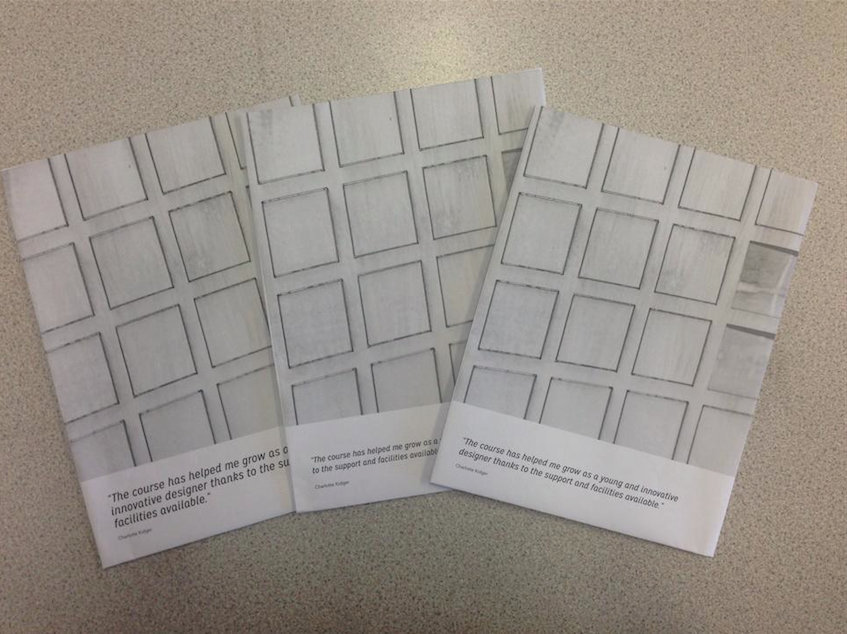
We printed out three different versions in order to see how the pt sized worked against the composition of the image and alongside the white space on the page.


No comments:
Post a Comment