
In order to gain a visual understanding of Harry Ramsden's in it's current state, I have collected a range of images that display it's exterior, interior and current branding. This will allow me to see what needs to be improved, whilst also acknowledging what is important to the brand, such as heritage.
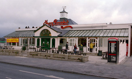
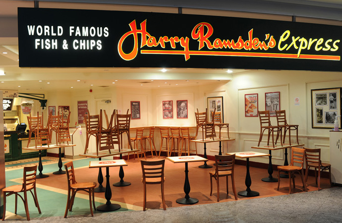
Restaurants
Overall, the brand has become quite tired and outdated, using colours that do not effectively reflect the environment or sector. There are too many harsh contrasts, making the visuals look extremely busy and quite sickly. The colours need to create a brand that is fresh and exciting, whilst giving an accurate representation of a fish and chip restaurant.
The current logo is not overly exciting, and can sometimes have too much going on in terms of lines, banners and shape. There are some positive aspects, however, which could be picked up on when it comes to altering the logo. The 'H' and 'R' for example are reflective of the Harry's, and could be used in a more contemporary manner.


Menus
Although the same logo is used within the printed material for Harry Ramsden's, it is very different from the exterior and interior of the restaurants. Nothing seems to quite fit together as part of an entire branded range. There is nothing exciting or eye catching about the menu, it simply displays what is on offer to purchase. Today, restaurants are using all kinds of innovative, interactive and illustrative ways to display food and drinks prices. Harry's menu needs to come together in terms of colour, aesthetics and content.

.tiff)
.tiff)
Food and drink
Again, some of the food and drink that is available within the restaurant is completely disconnected to the rest of the branding and visual identity. This is something that needs to be expanded on and experimented with.


No comments:
Post a Comment