
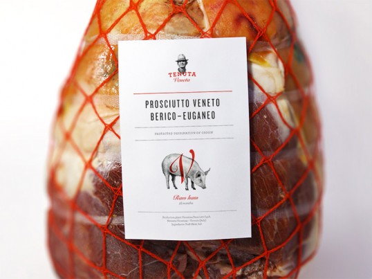
Tenuta Veneta, Manuel Bortoletti
The design for this organic food range is extremely clean and contemporary. The limited colour palette adds quality and luxury, whilst allowing for a clear and easy to read label. The products look extremely high end, and the introduction of an illustration is a quirky and interesting touch. This type of linear, gray scale illustration is something that I want to include within my own branding in order to reflect and represent the content, strengthening the identity of the restaurant.


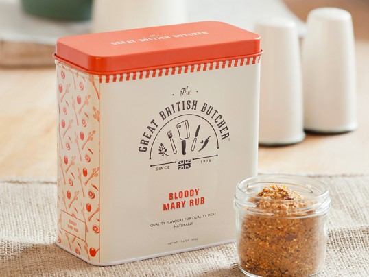
Great British Butcher, Design by Day
This design particularly stood out to me for it's use of illustration within it's logo and also how it has been used as part of a pattern application on the products. The logo has been kept simple, yet really stand out and reflects the sector it is intended for. This is something that the Harry Ramsden's logo needs to do. Complimentary colours have also been used to build up a product range that works effectively together, applying the branding on products such as aprons, tags and packaging.


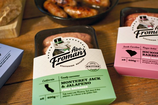
Abe Fromans, Robot Food
The shapes used in order to package the products caught my eye here, using the shape of the logo to cut out a window. This still displays the food contained, whilst creating an interesting sleeve to hold the packet. The colours used aren't necessarily three colours that I would have used for the desired product, however, there is some connection between the colour and the origin of the sausages, which may be key for the brand.


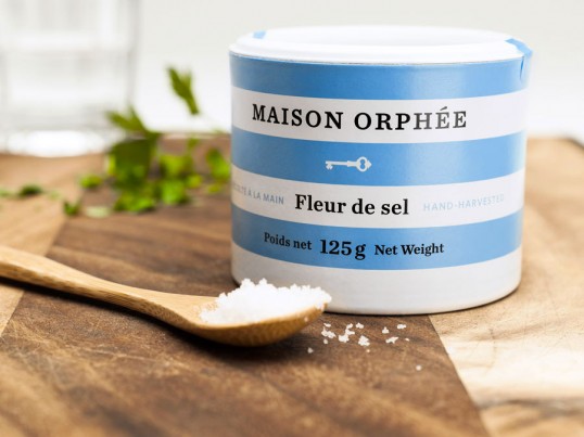
Maison Orphee, lg2boutique
The colours used for these salt products are extremely bold and eye catching, whilst not being too garish or busy. These products show how branding and colours can be applied to a range of products of different sizes, using type to create a clean and contemporary aesthetic. Photographed in context, it is clear that the product does it's purpose and reflects it's content.


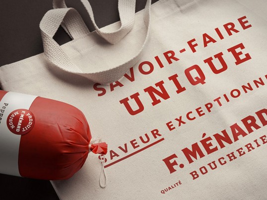
F. Menard, lg2boutique
Another example of how limited colours can create effective branding and visuals. Limited colours work well with food products as they can be quite hard to apply to. The images below also display how the branding and logo can be applied to different types of packaging depending on the item, such as the cellophane and sticker used on the chicken compared to the band.


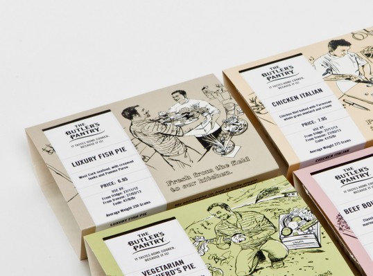
The Butler's Pantry, Brandcentral
Whilst I think the illustrations used on these products are detailed and interesting, I'm not sure that they are completely effective once applied. The overall face of the packaging looks too busy with the text placed on top of the image. Although white space has been used to try and counter this, I feel that it is quite tricky for the consumer to direct their eye at what is most important. However, I do like the muted colours that have been chosen in order to try and counteract the detail.

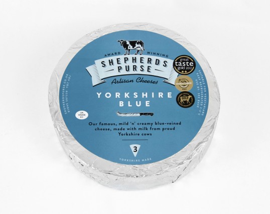
Sheperd's Purse, Robot Food
These stickers work perfectly on these cheese products, showing how the branding and imagery can be applied to different shapes, working within different sized spaces. The colours are extremely complimentary and really caught my eye.

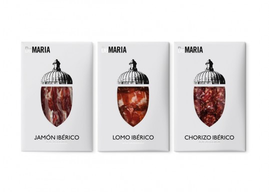
Maria, Enric Aguilera
These products below show how food can be used in order to build up and create imagery. This is innovative and effective, however I feel that the type and white space used around this looks quite out of place.
No comments:
Post a Comment